Rachael Robb, In Time
May 16, 2026
-
Rachael Robb, In Time
Venue: Sutton Gallery
18 Apr 2026 – 16 May 2026
I’ve been worrying about lead poisoning and thinking about time-warps in the week since visiting Rachael Robb’s solo exhibition, In Time, at Sutton Gallery. For the last thirteen years I’ve lived in share-houses in Brunswick and Coburg—notorious hotspots for lead-contaminated soil—tending vegetable gardens and chooks. We all knew about this in a general sense, saying we were eating “lead-eggs” and trying to remember to “assume it was likely,” according to the Victorian Environmental Protection Agency, that our houses were covered with lead-based paint which was slowly leaching into the earth. During this period as well was the publicisation of the much more serious, ongoing situation in Flint, Michigan, where the drinking water had been heavily contaminated since 2014. Despite this, or maybe because of it, even my horticulturalist housemate in Coburg didn’t want to actually test the soil there. This would be too real, the potential results too much a twenty-first-century memento mori for our collective liking.

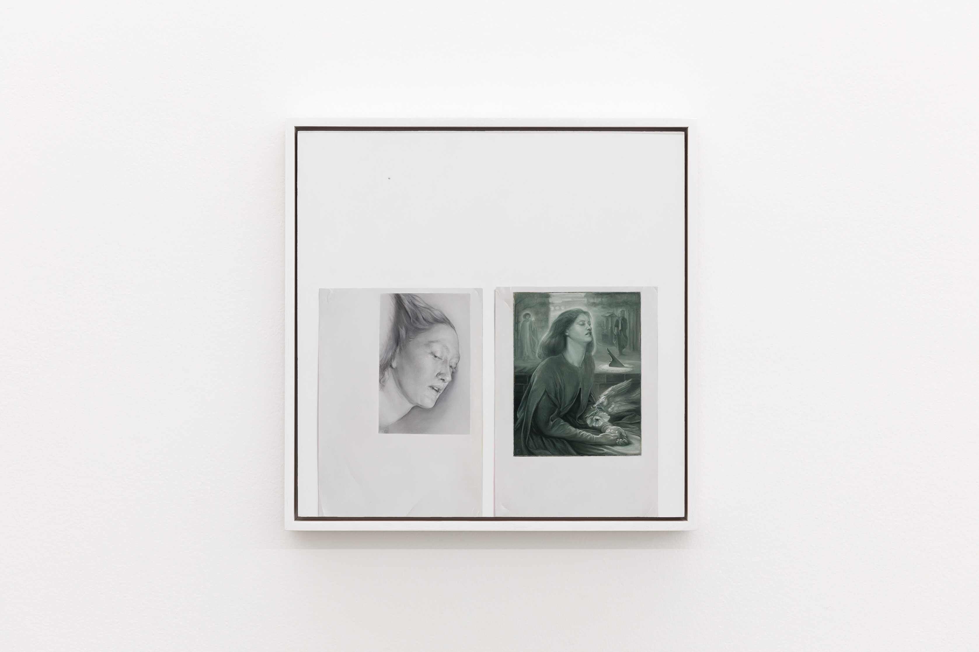
Rachael Robb, Printouts: Lizzie Siddal as Delia by Rossetti / Mei’s Ghismunda (Detail), 2026, oil on birch panel, 44 x 34 cm (framed). Photo: Andrew Curtis.

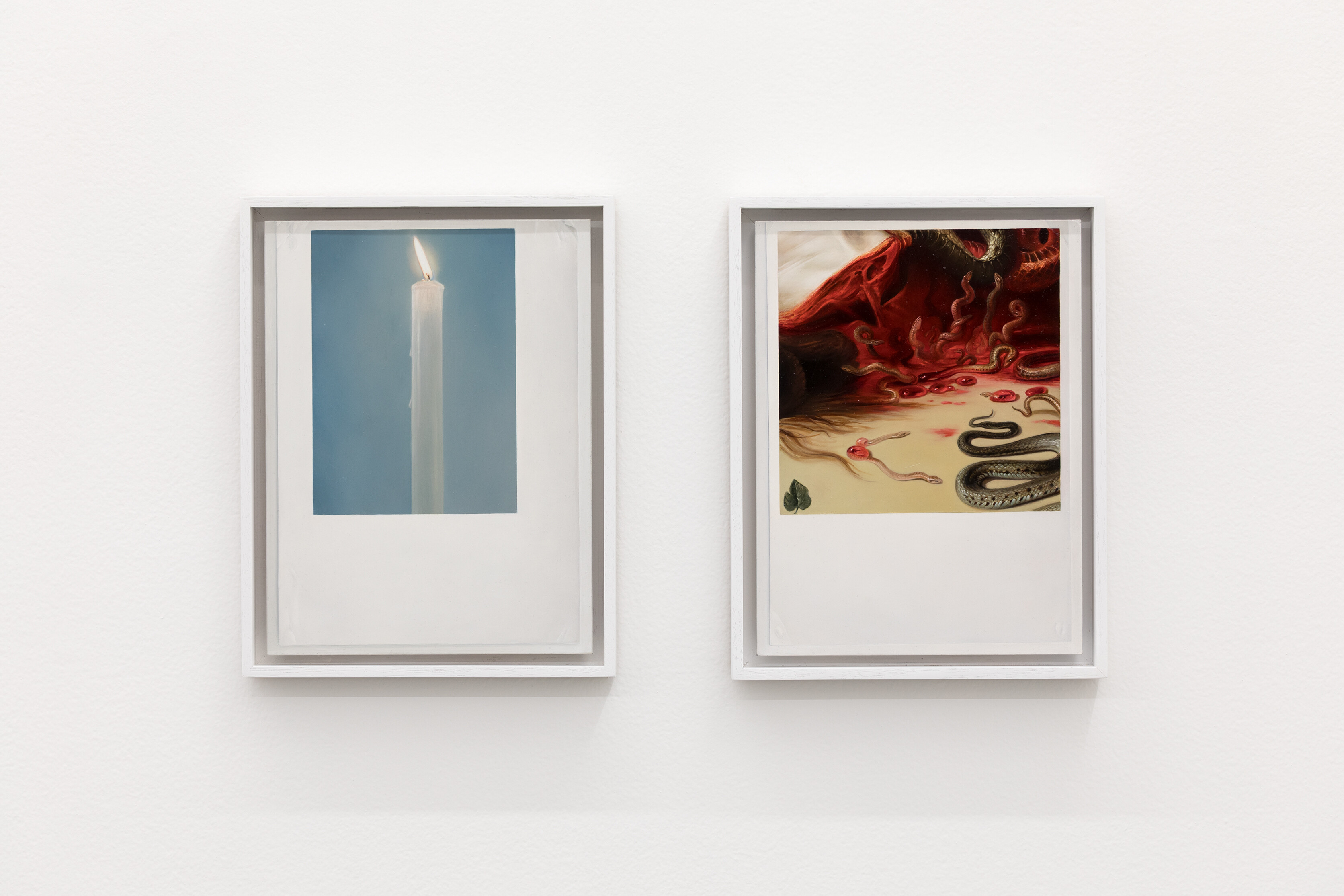
Rachael Robb, Diptych, printouts: candle and Reuben’s Medusa (neck detail), 2025, oil on gesso panel, two panels, 34 x 26.5 cm (framed, each). Photo: Andrew Curtis.
A dark sense of both persistence and finitude in Robb’s exhibition reanimated this existential concern, prompted by both the imagery and materiality of her seventeen oil-on-panel paintings. In Time’s imagery is replete with literal and symbolic references to human mortality—mostly via Robb’s cropped details of historical Western and Northern European artworks, though there are other images cited too. The sources of these appropriated fragments range from around the sixteenth to nineteenth centuries, and include examples from the Flemish Baroque and Dutch Golden Age periods to the Pre-Raphaelites and Symbolists. The exhibition text states that the artist uses Northern Renaissance oil-painting techniques—notable for the development of uncanny effects of verisimilitude—to render two decapitated heads, two skulls, some disinterred graves, a burning candle, and at least three women whom I later understand to be performing figures on the precipice of death. As I systematically identified each artwork cited by Robb—helpfully indicated by the works’ titles—I realised that each historical work was itself a rendition of a mythological or allegorical scene. An entirely separate review could be written on this alone—outlining the ways that these myths, predominantly associated with Western and Northern Europe (the region being a consistent focus of the exhibition,), are continuously reinscribed over history. Robb’s biography goes some way to account for this specific geographic scope—the artist having moved from Melbourne to the continent in the early 1990s before a recent return.
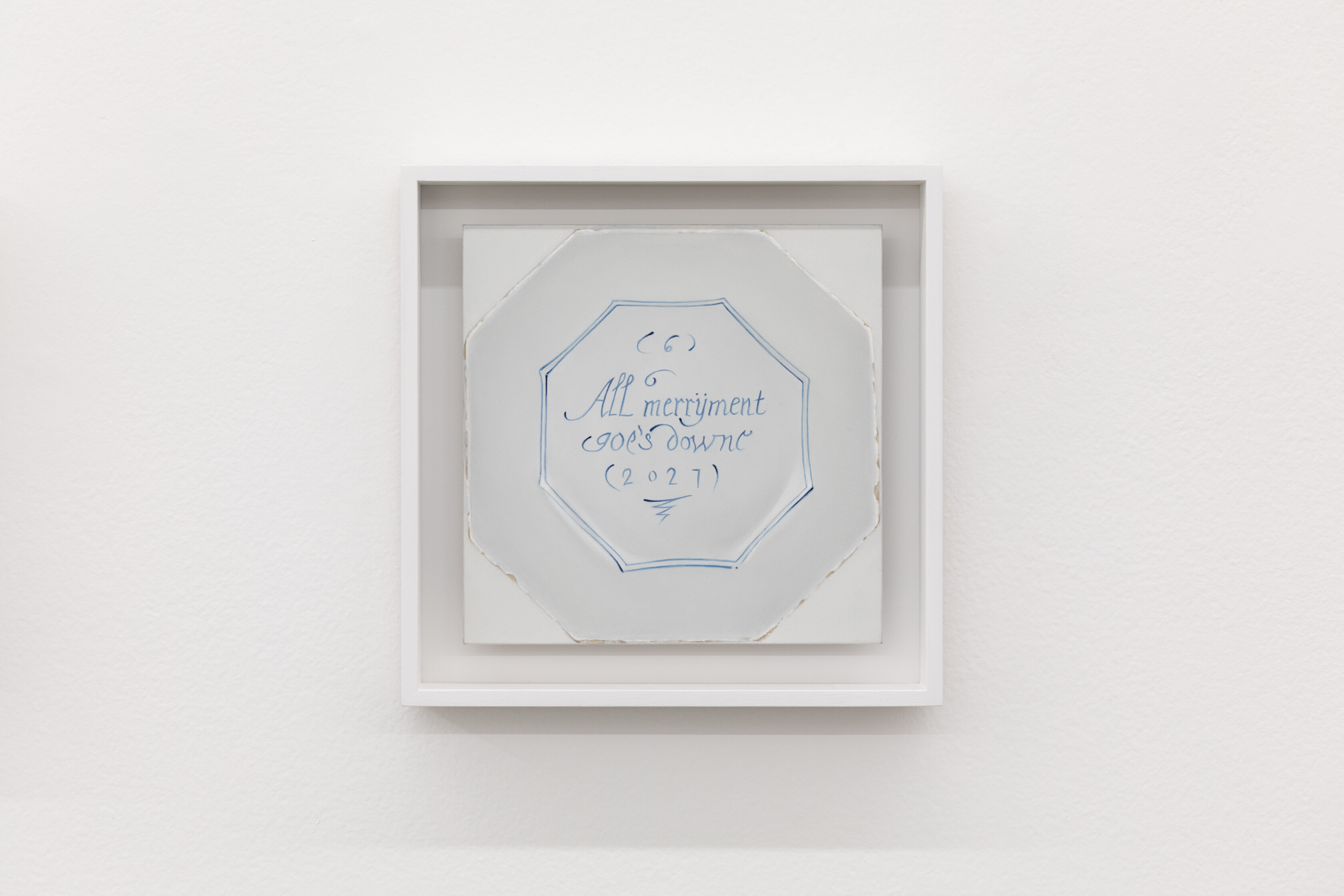
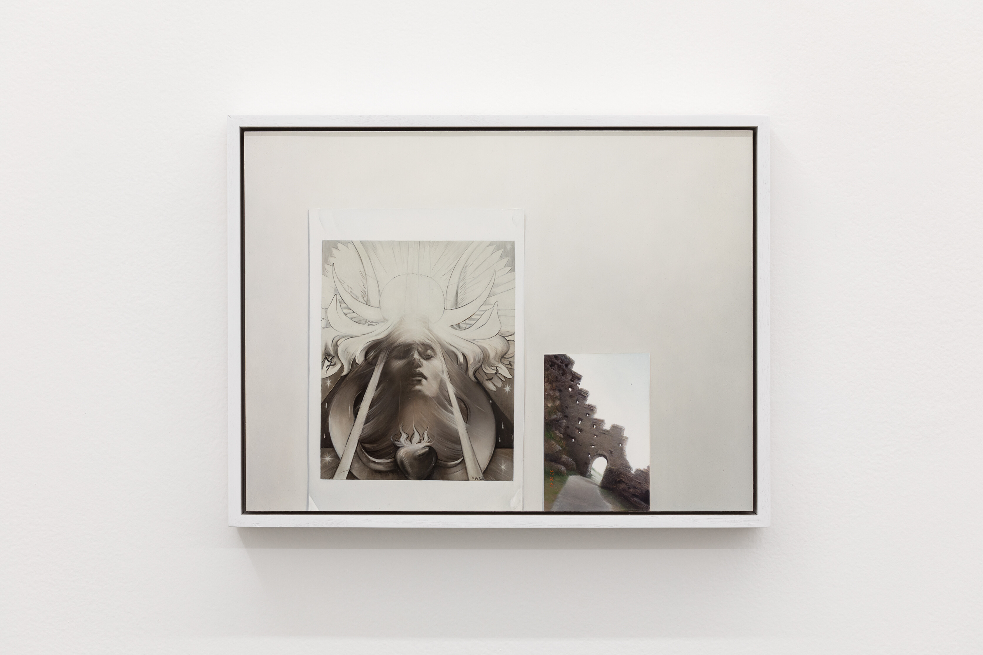
Similarly, a strange, anachronistic temporality evoked by the works could be expanded on much further than I have space for here. These looping time-warps are most explicit in Robb’s depiction of an eighteenth-century Delft plate, the last in a series of six “Merryman” plates, upon each of which is a line of a six-line verse. Titled All Merriment goes down, Delft plate (1727) (2026), the digits “(2027)” appear below the verse in the place usually reserved for the plate’s year of manufacture. Robb’s painted “7” is actually somewhat ambiguous, and could possibly also be read as a “1.” I am reminded of Mutlu Çerkez’s methodology of time-looping and painting repetition, a system where he would title a work with a future date, upon the arrival of which he would remake the work—not always through formal imitation but in a repetition of its concept. Another example is in Robb’s paintings which depict four-by-six-inch photographic prints, where in the corner of the print is the format’s familiar fluorescent orange date-stamp. I find out later that, rather than maintaining complete fidelity to the source image, the digits are decided during the painting process. In fact, my favourite moment in the exhibition is the painted photograph of Tintagel castle in Cornwall, built in the thirteenth century. The date here is “’92.02.29,” a leap day—however, the castle fell into ruin long before this calendrical hiccup was introduced. The image of ruins suggests an extended duration, but in this work I am also led to consider the strangeness of the widespread institution of an entirely new day in the calendar. (This was the principal shift introduced in 1582 by the currently-used Gregorian calendar, replacing the Julian system’s slight excess of leap-years, which functioned by having two days dated the 24th February every four years.) Lastly is the repeated appearance of Lizzie Siddal, English artist and model to the Pre-Raphaelites. Robb has selected three instances where artists have pictured figures from historical literature—all of whom are women beset by misfortune: Shakespeare’s Ophelia, Dante Alighieri’s Beatrice Portinari and, maybe the least tragic, Tibullus’s Delia. Siddal is at once existing in Tibullus’s first century, Alighieri and Boccacio’s medieval period, Shakespeare’s Elizabethan period, the nineteenth century of Siddal’s own lifetime and the Pre-Raphaelite painters, and 2026 when Robb painted the works and I see them. Folded in too are all of the instances where these figures have been, and will be, re-instantiated and re-presented. Siddal becomes a time-traveller like Virginia Woolf’s Orlando, though perhaps only at the behest of others. Robb’s Medieval cemetary photo (1995) (2025) recalls Siddal’s rude disinterment by Dante Gabriel Rossetti Siddal’s Pre-Raphaelite husband and painter of Robb’s Beatrice and Delia sources, for the dubious purpose that he could take back for publication a manuscript of poems he had laid beside her head seven years prior to her death by laudanum-overdose.

Rachael Robb, All Merriment goes down, Delft plate (1727), 2026, oil on gesso panel, 26 x 26 cm (framed). Photo: Andrew Curtis.
Despite the rich intertextuality of In Time, for me it is Robb’s consideration of representation by and through painting that is most compelling. In many of her works, she has painstakingly rendered thin sheets of white paper, upon which colour reproductions of the cropped historical paintings are printed, as well as the aforementioned photographic prints, which seem to be from a personal archive. Across the entire exhibition Robb instrumentalises oil paint’s capacity to produce effective trompe l’oeil, here modelling the subtle edges and surface textures of printed objects stuck on white walls. The illusionistic surface of these walls is similarly evoked through the occasional painted pin-hole or scratch. I also understood these as replica prints because of their formats: the familiar ratios of an A4 sheet and the four-by-six-inch photo, both of which (as far as I could tell) Robb reproduces on a one-to-one scale. (During my visit this research was conducted by holding the A4 exhibition text up to one of the works.) Painterly strategies of appropriation emergent in the second half of the twentieth century come to mind: conceptual artist Sturtevant, for example, whose “repetitions” (her formulation) or replicas of the works of her contemporaries were also to scale—however, Robb’s commitment to scale is to the mediated, printed object itself, rather than the artwork reproduced on its surface. Like Robb, Gordon Bennett also incorporated numerous discrete artworks together onto a single support in a process he described as “quoting,” describing his 1999 painting Home Décor (Relative/Absolute) Flowers for Mathinna #2 at the time as “at once one painting and many paintings.” More generally, the practice of artists figuring other artworks on their own throughout history is also, of course, a fundamental concern of In Time—from intertextuality to mimicry, citation and appropriation in painting by artists and art-forgers alike. Even by considering just the examples mentioned above, the ways by which this is enacted are as varied as the motivations for doing so, from painting’s material self-reflexivity to explorations of authorship, cultural misappropriation, and political representation, and in the case of art-forgery deception for financial gain.
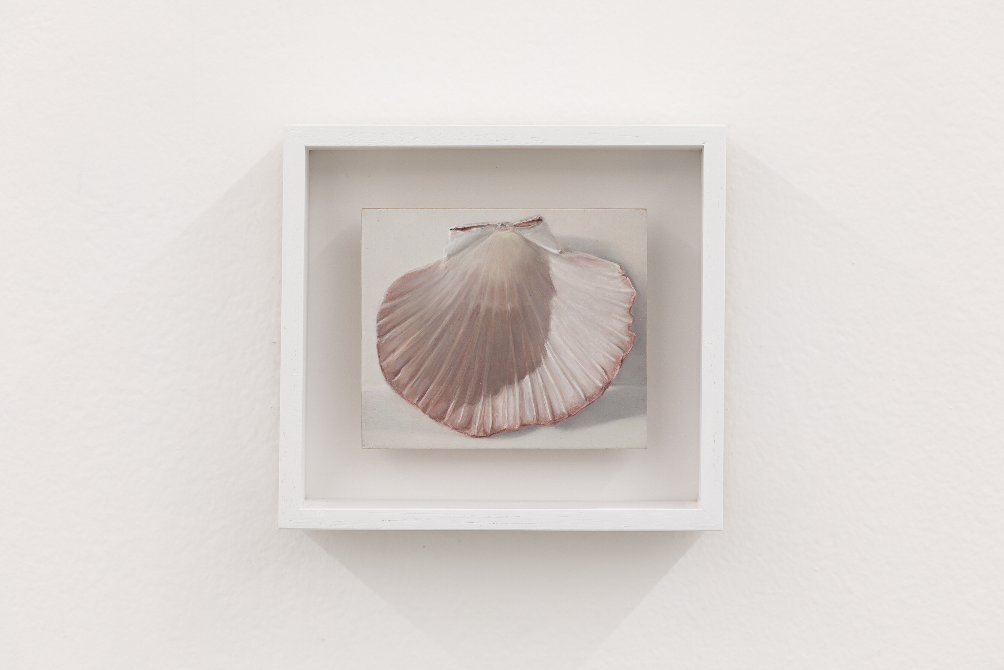
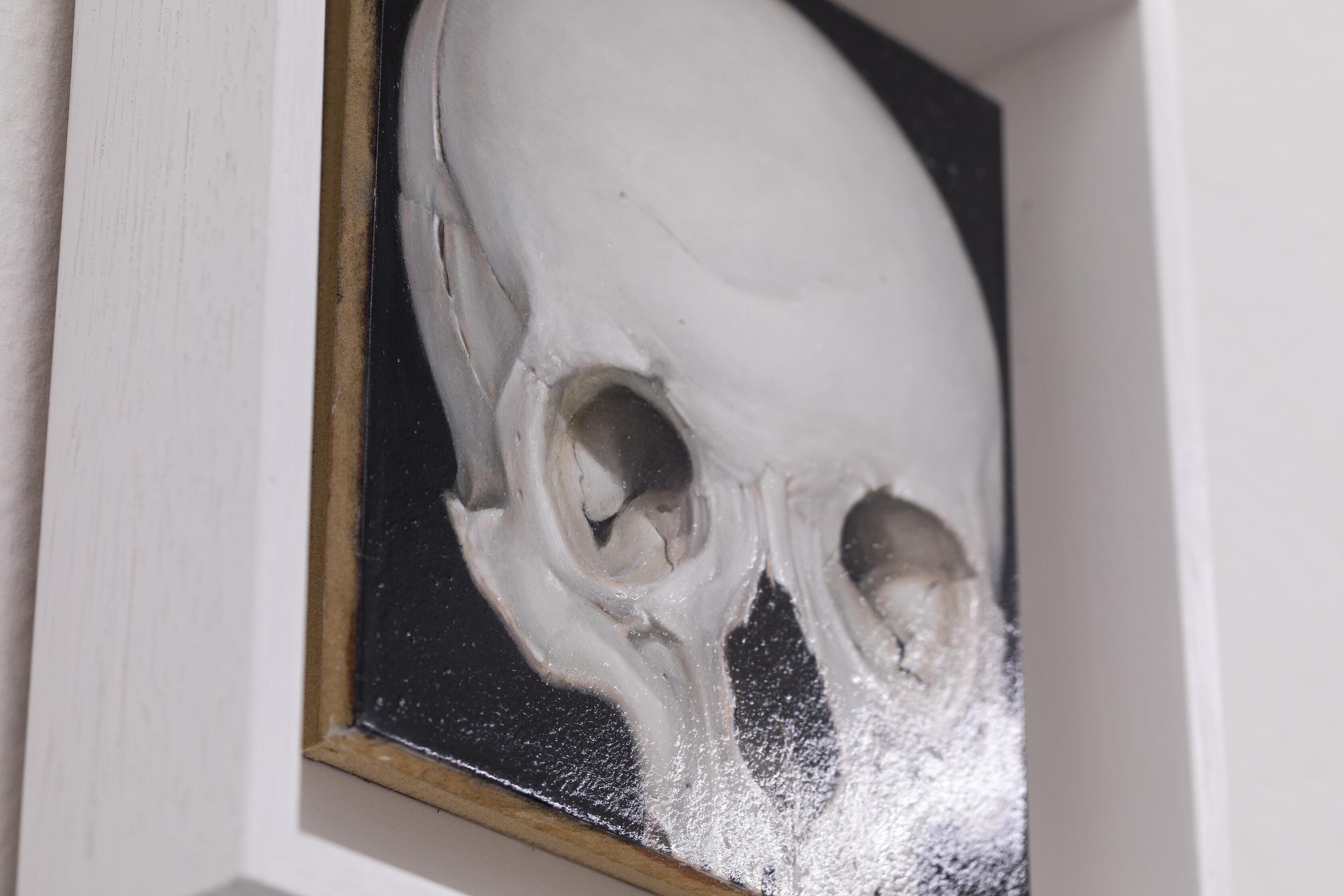
Returning to the flat, glossy surfaces of Robb’s paintings, I automatically read her printed-object compositions as visual research-materials stuck onto a studio wall, steeped as I am in dominant practices of reading and producing artworks—of identifying and elaborating the historical context in which these paintings were made and seem to refer to. These are reproductions of reproductions, representations in multiple ways displaced. My initial reaction to these works was of one familiar recognition: these printed objects depicted by Robb are a painters’ visual references, tools used in the long tradition of gleaning, citing, appropriating, stealing—whatever you want to call it—from previously existing works. I do this too. But then there are paintings like Skull (2025) and Scallop shell (2025), which by contrast appear strangely frameless. The eponymous shell casts a shadow against a white wall, but there is no painted frame of white paper to indicate another layer of mediation, and the skull almost reaches the edges of the wooden panel itself. The printed-object works prompt me to speculate on the nature of the source material or referent for these seemingly “frameless” works, but the question also feels incongruous. Instead, through Robb’s effective conceptual and technical deployment of trompe l’oeil, the latter compositions self-reflexively draw attention to the fact that the illusionistic painted surface covers the whole wooden board in all cases.

Rachael Robb, Scallop shell, 2025, oil on gesso panel, 16.5 x 14.5 (framed). Photo: Andrew Curtis.

Detail of Rachael Robb, Skull, 2025, oil on gesso panel, 20 x 18.5 (framed). Photo: Andrew Curtis.
Without considering this material status of Robb’s work, that is, when taken in by the trompe l’oeil, I detach the coloured image from its white paper support and surrounding wall. I unwittingly suspend my disbelief and am drawn into the fiction of representation—the frame vanishes. In the case of works like Printouts: Lizzie Siddal as Ophelia by Millais / as Beatrice by Rossetti (2026), even two faces painted onto the same birch panel can be read quite separately from each other. In these, Robb has produced the illusion, for me, of a painting which is at once a single work and somehow dissectible. Of course, this is the central concern of Kazimir Malevich’s Suprematism—present in In Time as a grubby postcard-reproduction of Black Cross (1915–24). For Malevich, this step into pure abstraction was needed in order for painting to move beyond what he understood to be a history of futile attempts at representation. In terms of the trompe l’oeil, however, its theoretically successful moment lies in the actual momentary overcoming of these attempts—where the painting doesn’t represent but is the object depicted—followed by a consideration of the material qualities of paint: how such illusions can be produced by this material and its supports. A twofold operation that reveals the materiality of painting through a deception intentionally designed to succeed, then falter. Both twentieth-century medium specificity and trompe l’oeil, developed centuries earlier, then, are self-reflexive approaches to painting—both of which are engaged by Robb in In Time.
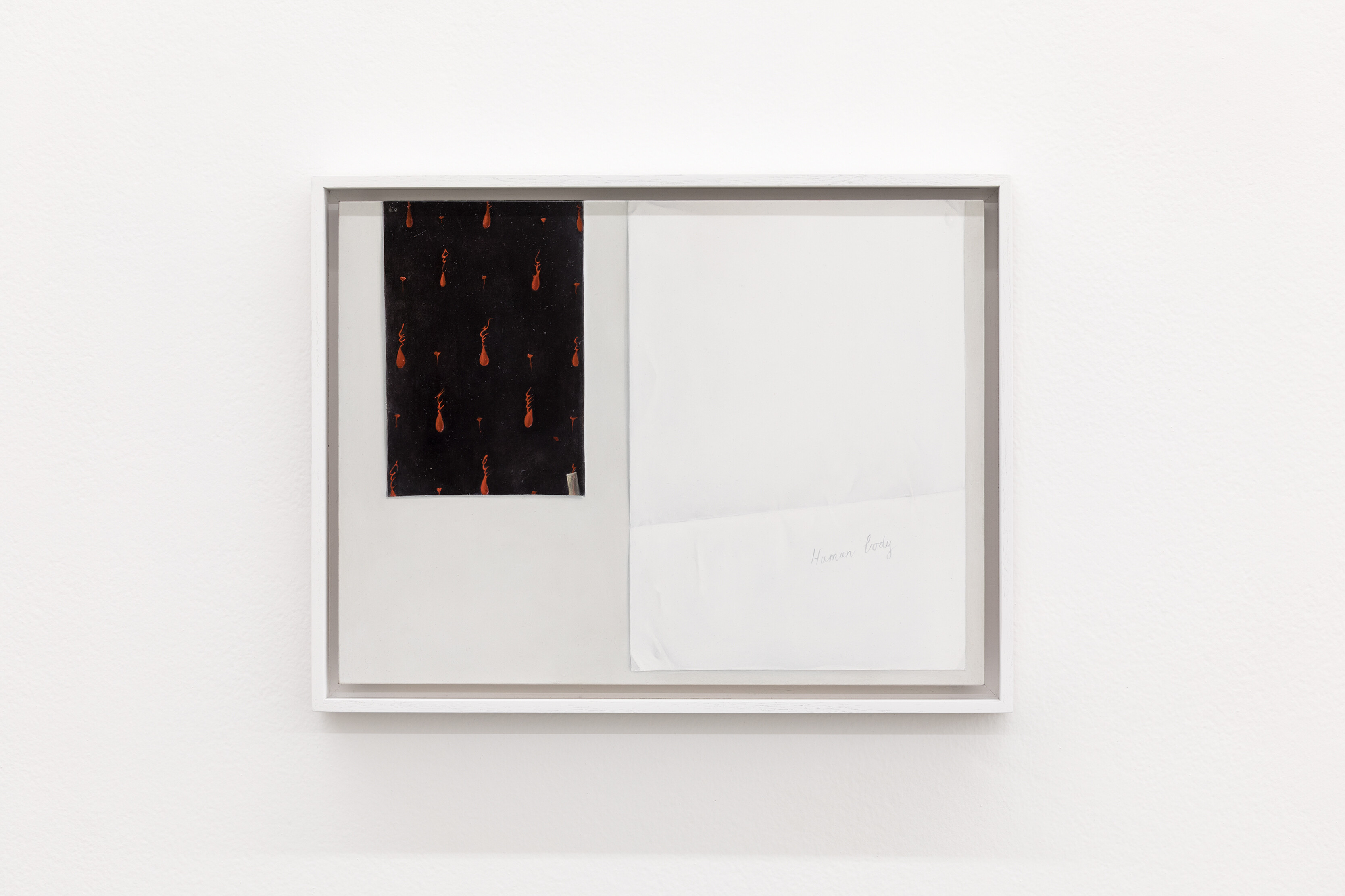
In another move that sees Robb questioning painting’s representational function, she proposes a counterpoint to the canonisation of Malevich as the inaugurator of non-objective painting. Through the inclusion of the black and red psalter page in Printout of Mourning page (ca. 1500) with A4 paper (2026), Robb perhaps recalls a point raised by Andrew Spira in his essay “Precedents of the Unprecedented: Black Squares Before Malevich,” (2022) where he writes that this page exists in the tradition of the fifteenth-century “mourning page”—a completely black page at the back of a book that represented abject grief—and connects this with the grief of Christ’s suffering and death where the psalter page functions beyond the symbolic. The logic of transubstantiation is at work here, where consecrated objects like the Eucharistic wafer and wine are not representations of the body of Christ, but his actual flesh and blood. Elsewhere, the page has been described as an object of Carthusian blood piety, in which the corporeal, gory details of the crucifixion became the focus of devotion. Inked or painted blood was the blood of Christ. These drops shed during his sacrifice were enumerated like the rosary and subject to devotional touch. In one example of this particular focus—amongst the many images produced of a very bloodied Christ—a Carthusian manuscript calculated the number of these drops to be precisely 547 500. The page opposite the one referenced by Robb appears to have been painted in the same way; however, on this side the black-and-red ink has been almost completely worn off—apparently through the act of devotional kissing or touching. Supporting this reading is Robb’s inclusion in her painting of an A4 sheet in place of this worn page upon which the words “Human body” are handwritten. For both the original psalter page and in Robb’s version too, whether the painting is an attempt at representation or not is dependent on religious belief.

Rachael Robb, Printout of Mourning page (ca. 1500) with A4 paper, 2026, oil on gesso panel, 34 x 44 cm (framed). Photo: Andrew Curtis.

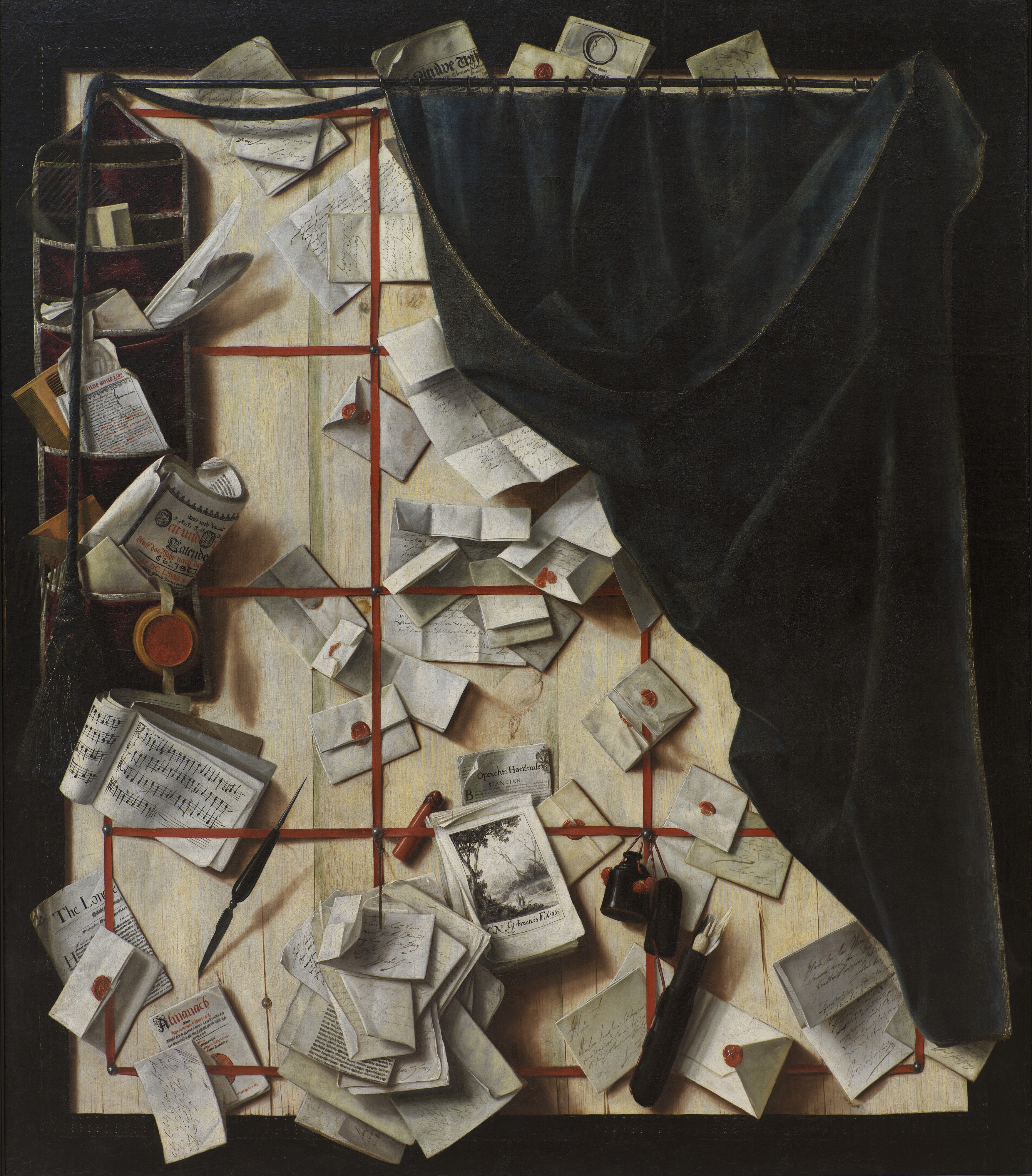
Cornelis Norbertus Gijsbrechts, Trompe l’oeil. Board Partition with Letter Rack and Music Book, 1668, oil on canvas, 123.5 x 107 cm, National Gallery of Denmark, Copenhagen.
In Time could also be read according to the logic of the quodlibet—a distinct sub-genre of the trompe l’oeil. The seventeenth-century Flemish painter Cornelis Norbertus Gijsbrechts is an interesting example here, less for the shared focus with Robb on memento mori iconography, and more for their deep engagement with the conceptual workings of the trompe l’oeil itself. Roughly translated from the Latin as “how you like it” or “as you please,” the quodlibet usually depicts domestic ephemera like letters, pamphlets, stationary, and other printed material, often stuffed into a wall-mounted letter-holder. Robb’s printed-material paintings could be seen as contemporary versions of the quodlibet—developed and popularised in Gijsbrechts’s time, and one of his favoured forms. Like Gijsbrechts and contemporary Glaswegian painter Lucy McKenzie, the artists each use the quodlibet to think through contemporary modes of mechanical reproduction and circulation: the printing press, in Gijsbrechts’s day, and digitally circulated and reproduced text and image by McKenzie and Robb. However, in contrast to these other artists—whose quodlibet works are haphazard, eclectic, and dimensionally bound by pin-board supports—Robb’s versions are comparatively restricted and spare. Only one or two printed objects are included per painting, and her white walls extend virtually beyond the edges of the wooden panels. It is in this spareness, with its emphasis on planes of white, as well as by considering the paint on the palette and through the still-life in Gijsbrechts’s Cut-Out Trompe L’oeil Easel With Fruit Piece (1670–72) (I’m thinking of the practice of painting paint with paint, here), that I come to think that aspects of Robb’s works can be considered in their non-objectivity too.

Cornelis Norbertus Gijsbrechts, Cut-Out Trompe L’oeil Easel With Fruit Piece, 1670–72, oil on panel, 226 x 123 cm, National Gallery of Denmark, Copenhagen.
The white pigments used in contemporary oil paints, usually titanium dioxide and zinc oxide, are also present in a broad array of commercial and industrial products. The wall paint of Sutton Gallery, as well as that used on the paintings’ frames, likely contain one or both of these pigments. They’re used as a filler in white paper as well as in some ceramic glazes. Considering Robb’s works according to their materiality in this way, their painted white walls, paper, ceramic and paintings take on a status of non-objectivity. Diverting this logic from just white pigment for a moment, I wonder too whether Robb used a cobalt blue to paint the text on the Delft plate—the blue glaze of which would also have been made from the same toxic cobalt oxides. On some level, the objects Robb represents and the oil paint are materially identical. It’s here that I loop back to the exhibition’s focus on mortality and the memento mori, thinking about the widespread use of lead-white pigment in artists’ oil paints until the early nineteenth century with the introduction of the less-opaque zinc and lithopone whites. While lead white and other toxic pigments (of which there are many) can be used relatively safely, the risk still exists, and I know a number of painters who have had their blood tested for heavy metals that can slowly accumulate over years of exposure.
It’s not only human decay that I’m thinking of, though. Pigments and their binders are also temporally indexed, most visibly in the cracking and yellowing of paint films over decades and centuries. Through editing Melbourne painter David Egan’s book Colour Handling, I discovered Tony Conrad’s Yellow Movies (1972–73)—a series concerned with exactly this quality of paint. On supports around two-by-three metres in size, Conrad painted a series of rectangles using low-quality white housepaint. He exhibited these at a one-night-only “screening” in 1973, suggesting that the indescribably slow (relative to the duration of most films) yellowing of the paint was the content of the films. While Robb doesn’t propose this filmic connection, this aspect of their materiality links them to duration in the same way—though interestingly she doesn’t replicate the cracks that have formed in the paint-film of the historical works she appropriates. My understanding that oil paint yellows as it ages has recently been complicated, however, through a recent conversation about white pigments with Egan and another Melbourne painter, Tim Bučković—with both of whom I teach undergraduate painting. We were nerdily discussing the lithopone white recently acquired for students’ use, noticing that the painted swatches on the tubes had a much yellower hue than the paint inside. Bučković—who incidentally primes his canvases with lead-white (safely, he assures me)—hypothesised that this yellowing isn’t due to age, but rather a reversible process especially noticeable with white paints called “dark yellowing,” where recently-painted surfaces rapidly yellow if left in the dark. Exposure to light will slowly but surely induce the paint-film to lose this yellow cast over weeks, as if Conrad could hit rewind on his films. What I had thought was an irreversible change now seemed like a time-warp, and I think about the future of Robb’s In Time paintings. If covered from light in storage, their surfaces will undergo both age-induced and dark yellowing. When exposed to light again, they will appear, to someone unfamiliar with this dark yellowing process, to de-age—a process which can repeat many times until the paint eventually stabilises.

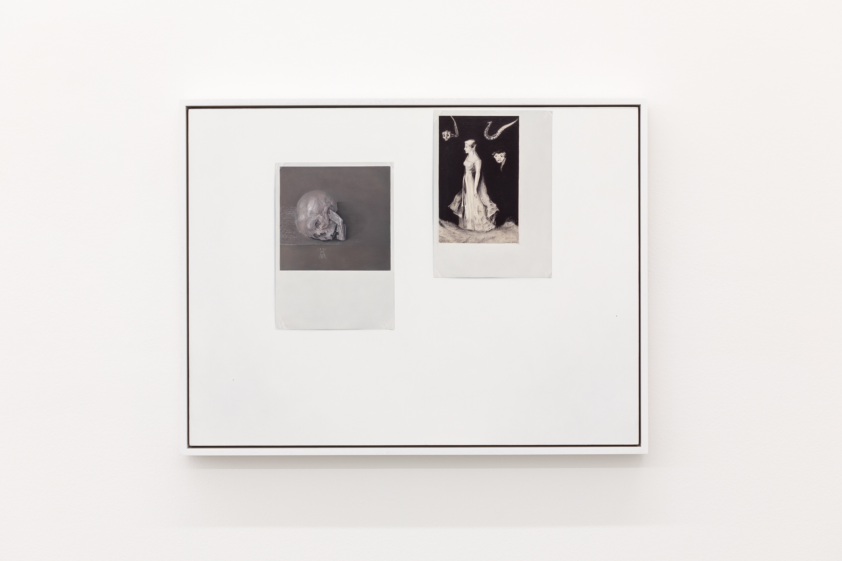
Rachael Robb, Printouts: Dürer skull (1521 AD), and Redon haunting, 2026, oil on birch panel, 63.5 x 83 cm (framed). Photo: Andrew Curtis.

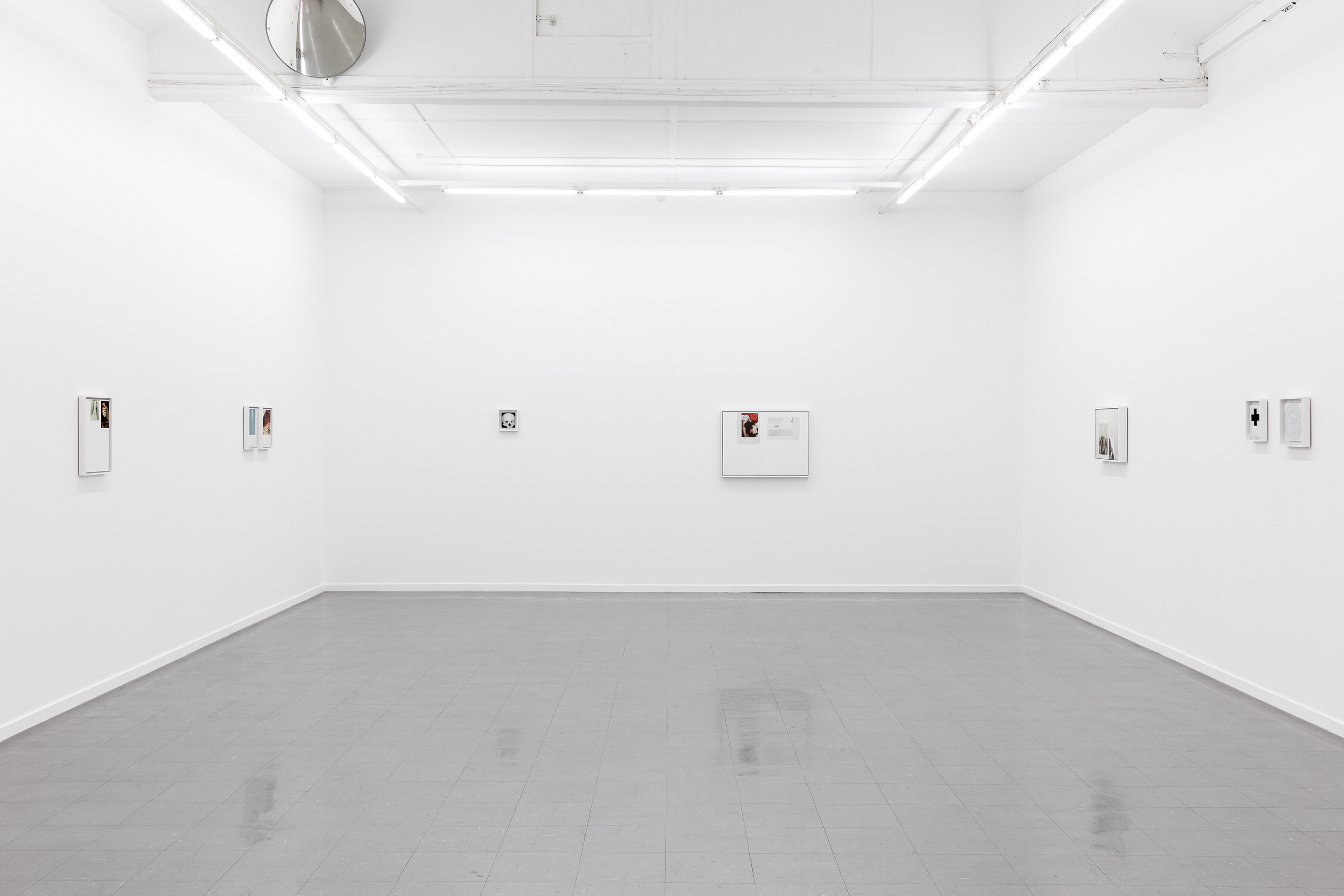
Installation view of Rachael Robb, In Time, 2026, Sutton Gallery, Melbourne. Photo: Andrew Curtis.
Conservators use the anachronistic appearance of pigments as tool to detect art forgeries; it was the untimely presence of titanium white in a forgery by the infamous Wolfgang Beltracchi, for example, that led to his downfall in 2011. I’m unsure if Robb has actually used lead white in these works, but the fact that it was the white of choice in the paintings she appropriates connects the pigment to In Time inextricably. The use of lead in most artists’ oil paints has now been narrowly restricted, though genuine lead-white oil paints are still commercially available. The inclusion of lead in other products like household paints has, as noted, been controlled for over fifty years now in this country and others—however, lead exposure and poisoning remain a hazard for many people globally. The fact that pre-nineteenth-century painters were using this material to paint, amongst everything else, memento mori strikes yet another questioning of painterly representation raised by Robb’s In Time—one that I’m going to have to reflect on for a while.
Gallery